For most studios, Instagram does the attracting. Someone sees a reel of your reformer room in morning light, taps through to your profile, and then taps the link in your bio. That link usually goes to your website, and that's where they decide whether to book a first class or keep scrolling.
If your website feels nothing like your feed, hides the intro offer or makes the timetable hard to read on a phone, you lose people at the exact moment they were ready to try you. Here's what a Pilates studio website needs to turn that interest into bookings.
1. Your intro offer, front and centre
Someone new to your studio is looking for one thing: how to start. Your new client offer should be in the first screen of the homepage, written as real text, with a button that goes straight to booking.
On phones, a booking bar that stays at the bottom of the screen as people scroll keeps that next step in reach. It's a small detail, but it removes the "where do I actually book?" moment that makes people give up.
Keep the offer simple. What they get, what it costs, how long they have to use it, and one button.
2. A timetable that works on a phone
Your timetable is probably the most visited page on your site. It's also often the worst on a phone: a cramped booking widget that looks like a spreadsheet and needs pinching and zooming to read.
Most studio platforms, like Mindbody, Momence and Arketa, offer a timetable and booking widget. I build that into your site and style everything around it, so it looks like part of your brand while bookings still happen in the system you already use. Your schedule updates automatically, so there's no double handling.
A good timetable lets people:
- Flip between days quickly
- See the class, instructor and time at a glance
- See how many spots are left
- Filter for beginner-friendly classes
3. Classes explained by level
New clients often don't know the difference between reformer, mat, barre, "sculpt" or "burn". If your class names are creative, that's lovely for your brand, but it can leave beginners guessing.
Give each class a short description: what it is, how hard it is and who it suits. A simple level system (like foundations, all levels and advanced) helps beginners feel welcome and lets regulars find the tough ones.
4. Instructors people connect with
People book the person as much as the class. A page with a photo, a short bio, qualifications and what each instructor's classes feel like helps new clients find someone they'll click with. It also gives your instructors something to share.
5. Pricing that's easy to compare
Studio pricing gets complicated fast: intro offers, casual classes, class packs, memberships, and sometimes different prices for reformer and mat. If people have to do maths to work out what's best for them, some won't bother.
Lay it out clearly, with each option side by side and a short note on who it suits. For example:
| Option | Best for |
|---|---|
| Intro offer | Brand new clients trying the studio |
| Casual class | Visitors or people who drop in now and then |
| Class pack | Regulars with a changing schedule |
| Membership | People coming two or more times a week |
Add your real prices and inclusions, and keep them as text rather than a graphic so they're easy to update and easy for Google to read.
6. A brand that feels like your studio
Walking into a good studio has a feeling: calm and light, or energetic and sweaty, or somewhere in between. Your website should give people that same feeling before they arrive.
That comes from the colours, type, photography and even the way things move on the page. It should also line up with your Instagram, so someone tapping through from your feed feels like they've landed in the same place. Link back to your Instagram clearly, and consider showing your latest posts on the site.
If your branding needs work first, I can design your logo, colours and type and carry them straight into the website.
7. Easy to keep fresh
Workshops, new instructors, seasonal offers and price changes all need updating. Your timetable updates itself from your booking platform, but the rest needs a simple way to change. You can either send changes to me and I'll make them, or I can set your site up with WordPress so you can update offers, instructors and class descriptions yourself. There's more on both in Website hosting explained.
The mistakes I see most often
When I looked through dozens of independent business websites around Bondi, Coogee and Randwick, the studios themselves were lovely. The websites kept running into the same problems:
- Intro offers shown as a picture of text, so they can't be read by Google or screen readers
- The Book button hidden inside the menu instead of on the first screen
- Timetables that only exist inside a clunky booking widget and are hard to read on a phone
- Blurry or pixelated hero photos, the very first thing a new client sees
- Footers stuck on 2020 or 2022 while the page advertises this year's workshops
- No Instagram link, even though that's where most new clients check you out first
Quick checklist
- Intro offer in the first screen, as real text
- A booking bar that stays on screen on phones
- Timetable connected to your booking platform and readable on a phone
- Every class described, with a level
- Instructor profiles with photos
- Pricing laid out side by side
- A look that matches your studio and your Instagram
- Sharp, real photos of your space
See it working
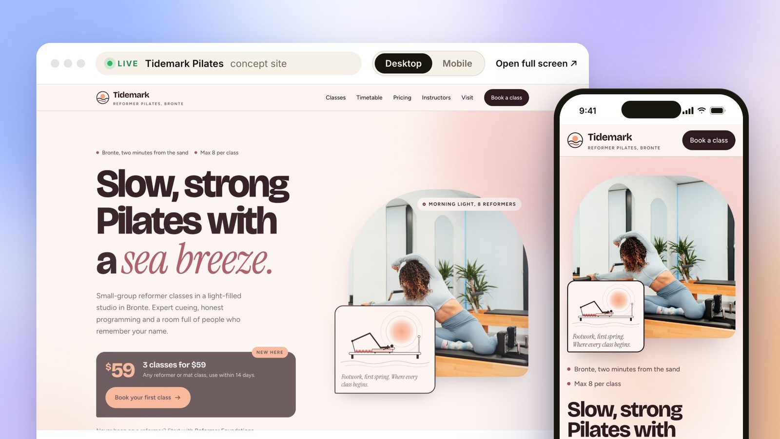
To show what this looks like, I designed Tidemark Pilates, a fictional reformer studio in Bronte. It's a concept, not a real studio, but it runs live on my Pilates studio websites page. You can flip through the week on the timetable, book a class and watch the spots count down, and filter for beginner classes in one tap.
Custom websites start from $1,500, and extras like more class types, instructors or pages are quoted up front before anything starts.
Try the Tidemark Pilates demo →
Want a website that feels like your studio? Tell me about it.
Start a conversation →Personal reply within 24 hours, always from me.
Chloe, Coco Creatives. Sydney web designer with 8 years in web design and branding. I design and build every site myself, from our first chat through to handover.