Envantage IP
A full rebrand for a legal services firm: Phoenix IP Services became Envantage, with a new logo, three sub-brands, reports, presentations and a mobile-first website.
- Client
- Envantage IP
- Category
- Branding
- My role
- Creative direction and lead across branding, UX and UI
The brief.
Envantage works in the legal industry, with a process its founder created to help businesses identify their resources and build a lasting competitive advantage. The founder trademarked that core process, along with three more: Lumio, Amplio and Scena. Each one needed to work as a sub-brand under the main Envantage brand.
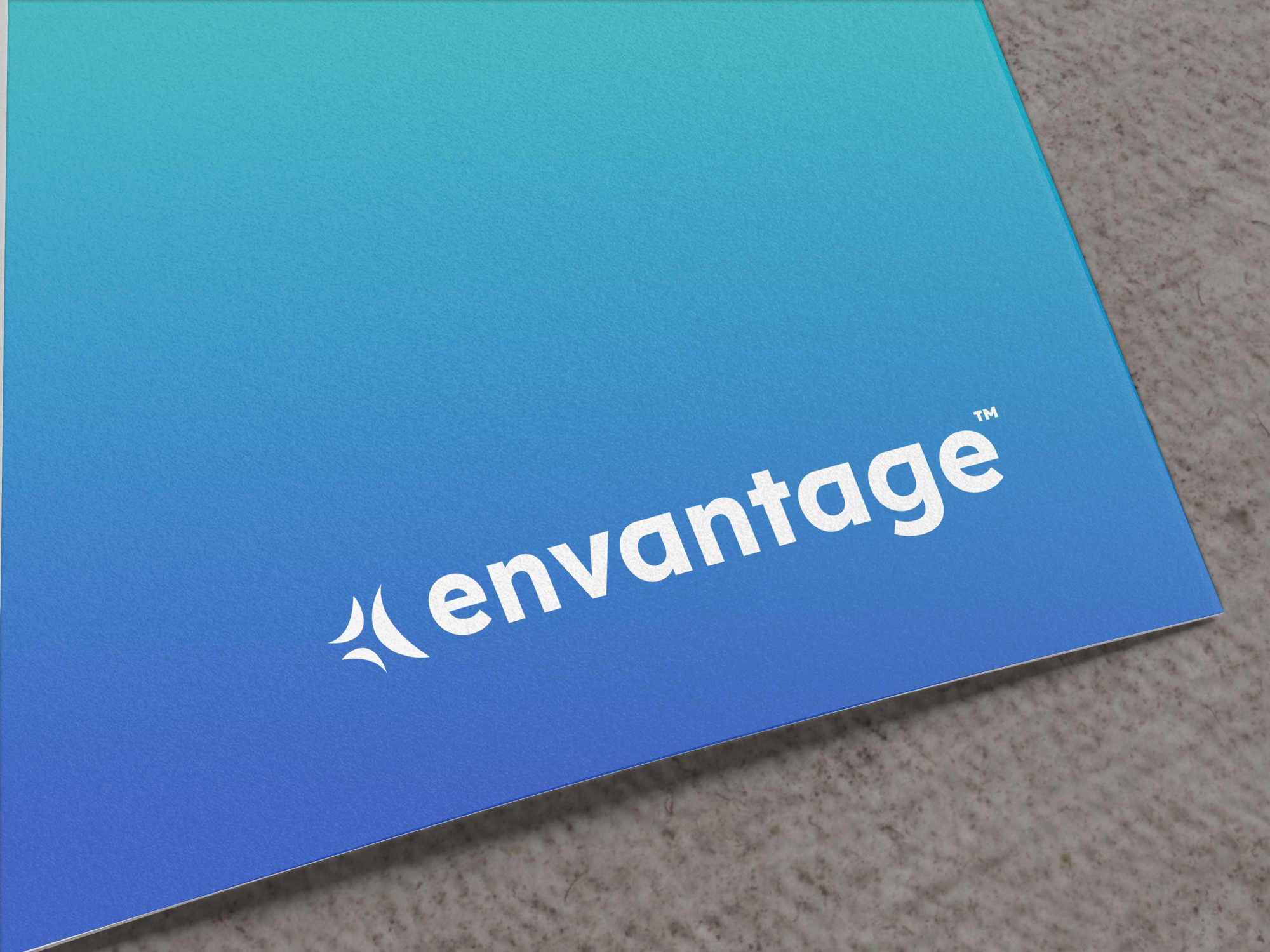
The business came to me as Phoenix IP Services, looking for a rebrand. The result was a new name, Envantage, and a new identity carried across every branded touchpoint: the logo, reports, presentations and the website. The goal was a more contemporary brand that feels innovative and forward-moving.
How it came together.
Brand foundations
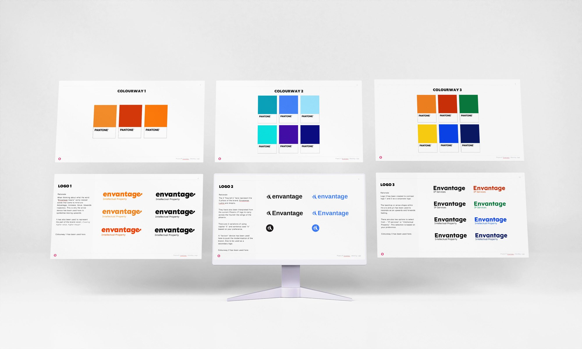
Beyond the logo, I built out the wider brand: messaging, guidelines and rules that keep every channel consistent. I explored several logo and colour directions before landing on the final mark, a bold lowercase wordmark on a teal to blue gradient, with Lumio, Amplio and Scena designed as a family around it.
User experience
The website is often a client’s first impression, so it was designed mobile-first to work wherever people are most likely to find it. The brand carries straight through into the digital experience, so it feels like one business everywhere.
Web design
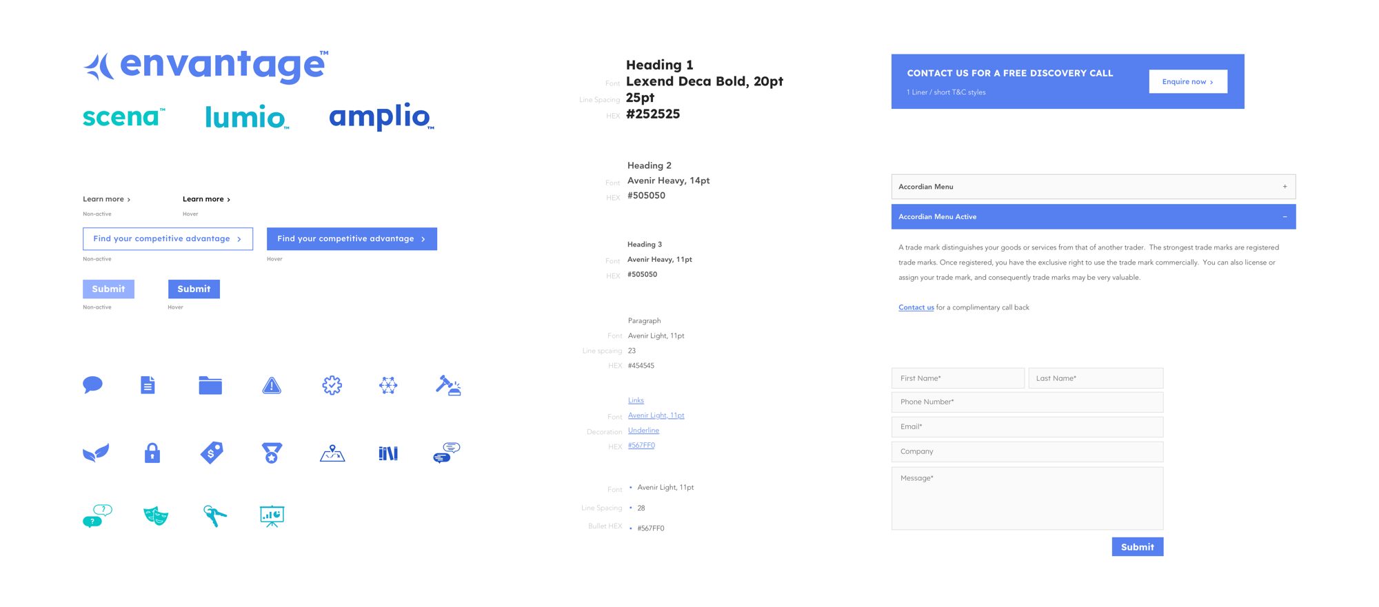
I defined a full UI style sheet, from type scale and colours to buttons, forms, icons and accordions, then designed the site from wireframes to interactive prototypes, refining it with feedback until it was ready to build.
Selected work
2 images