SAGE
Recognising the evolving dynamics of the business landscape and the need to align with the changing needs of clients, the decision to rebrand reflects a proactive approach to adapt and thrive in the post-pandemic era.
- Client
- Sage Digital Agency
- Category
- UX/UI Design
- My role
- Lead UX & UI Designer
The brief.
The in-house rebrand took place alongside a collaboration with a freelance digital designer — me — for the creation of the new website. This dual approach allowed a seamless integration of the internal rebranding vision with external expertise in digital design. The in-house team focused on evolving the brand identity, strategy and internal communications, while the website’s design and development were entrusted to me, bringing a fresh, independent perspective to the online presence.
This collaboration reflects a strategic decision to leverage both internal insight and external creativity, ensuring a holistic transformation. The synergy between the in-house rebranding effort and the external website design contributes to a cohesive brand evolution, marking a significant step forward for Sublime Australia — now Sage Digital Agency — in its post-COVID journey.
How it came together.
We started with a website audit, analysing the old site as the starting point for what could be done better this time. As the site was already up, we were able to understand the needs and behaviours of real users. We gathered information through client interviews, reviews and testimonials, competitor research and observation sessions, building a picture of navigation habits, pain points and preferences. That made the site maps, information architecture and hierarchy data-driven decisions rather than assumptions.
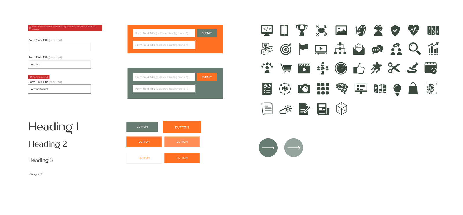
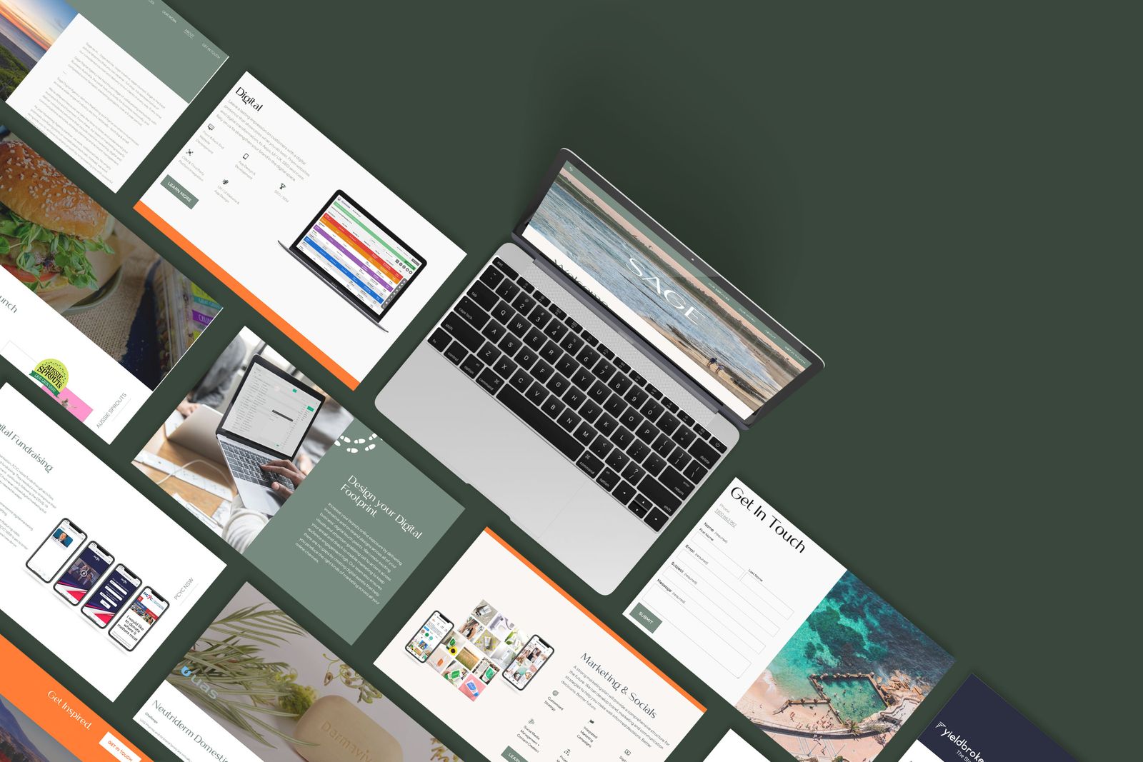
The design takes a minimal, sophisticated approach: clean layouts, a limited colour palette, and whitespace used as a design element so the focus lands on the essentials. Typography is chosen with care and high-quality imagery is placed thoughtfully, creating a harmonious visual narrative. Navigation is streamlined, while subtle animation and consistent branding elements add a touch of sophistication. The whole design is mobile-first, so it responds cleanly across devices.
SAGE was built in Squarespace, and we have recently been transitioning it over to HubSpot’s new CMS builder. This lets the business centralise its communications and improve tracking, so we can learn more about user behaviour and how people interact with the site.
It is currently in the testing phase. As HubSpot is a new CMS there are some bugs to fix — but that is all part of the iterative design process, and exactly why user testing has been so important.
Selected work
3 images