Calltime
A complete website design and build for an independent business communications provider — covering a brand refresh, every page of copy written around SEO keyword research, and a design signed off from three homepage directions before the rest of the site was built.
- Client
- Calltime
- Category
- Business Communications
- My role
- Brand refresh, content, design & build
The brief.
Calltime advises Australian businesses on how they communicate — phone systems, connectivity, mobile, security and cloud contact centre — recommending what actually fits rather than selling from one vendor’s catalogue. Eleven services in all, each of which needed to be findable, understandable and easy to enquire about.
The brand already had equity worth protecting: the red wordmark is what customers recognise. What had dated was everything around it. The palette had nowhere to go beyond red, the typography felt of its era, and there was no system for telling eleven services apart. There was also no site copy to work from — every page had to be written from scratch.
How it came together.
Competitor research and a direction
I started by looking at how the rest of the category presents itself: the big telcos, the independents, and the managed service providers Calltime competes with for the same enquiry. Most of it looked the same — stock imagery, vague promises and product lists with no point of view. That gap became the brief. I gathered references from outside the category as well as inside it, and we agreed on a direction before any design work started.
Refreshing the brand
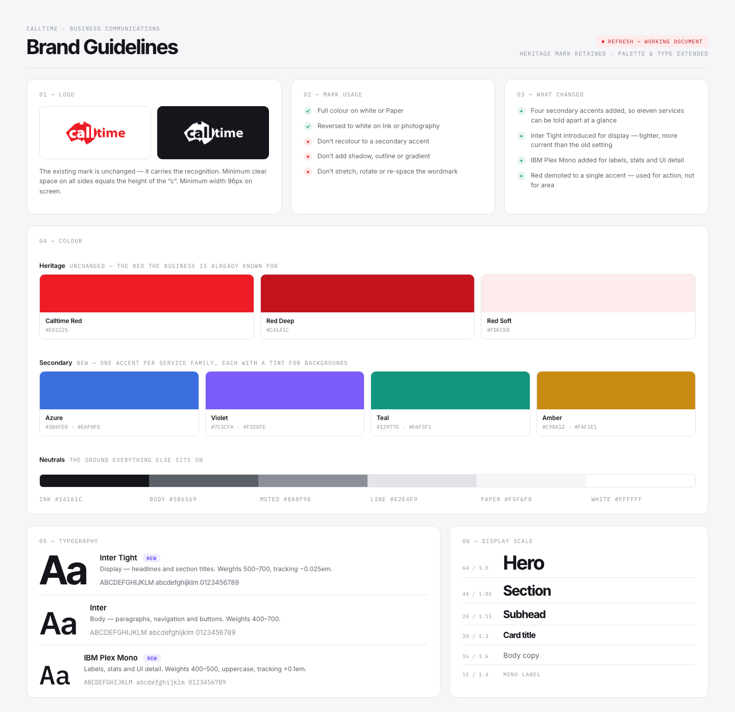
The mark stayed exactly as it was. It carries the recognition and there was no reason to touch it. What I added was everything around it. Four secondary accent colours, each with a background tint, so eleven services can be colour-coded and told apart at a glance instead of all competing in red. Two new typefaces: Inter Tight for display, which sets tighter and more current than what was there before, and IBM Plex Mono for labels, stats and interface detail. Red was demoted from a background colour to an action colour — used for buttons and emphasis, not for filling space.
I documented the result as a working set of guidelines, so the additions stay consistent as the site grows.
Writing the content around search
Calltime had no site copy, so I wrote all of it. I drafted using AI, with keyword research setting the structure: what people in each industry actually type when they’re looking for a phone system, a 1300 number or a cloud contact centre, and which of those terms Calltime could realistically rank for. Those terms shaped the page structure, the headings and the service names themselves, so the copy reads naturally but every page has a job in search. Everything was edited and checked against what Calltime actually offers before it went in.
Designing and building the rest
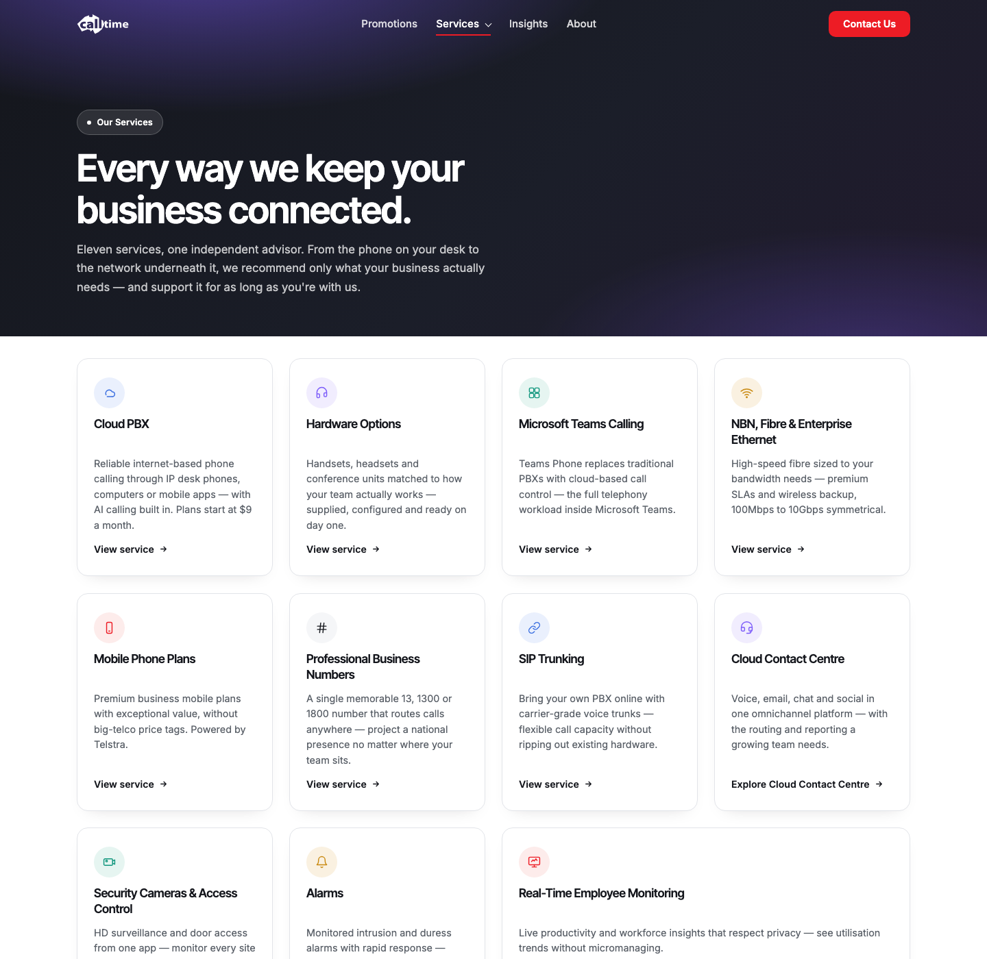
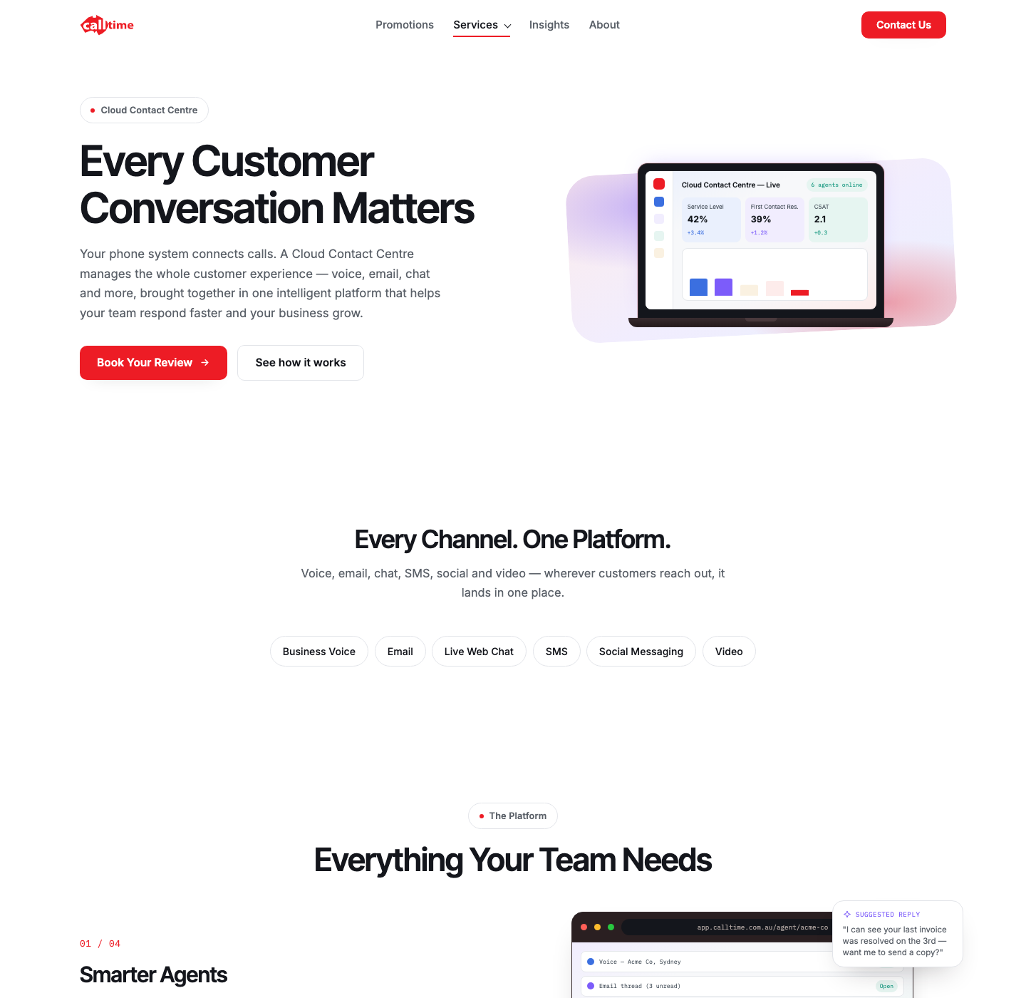
With the homepage signed off, the chosen direction was rolled out across the whole site: the eleven-service index, a dedicated Cloud Contact Centre page, Insights, About, Promotions and Contact. Each page reuses the same components, spacing and type scale, so the site stays consistent and is straightforward to add to later.
Where it landed.
What was delivered:
- A multi-page website covering all eleven services, plus Cloud Contact Centre, Insights, About, Promotions and Contact
- A refreshed brand system — heritage mark retained, four secondary accents and two new typefaces added, documented as guidelines
- Every page of site copy written from scratch and structured around keyword research for the industry
- Three fully designed homepage directions, with the selected one carried through the entire build
- A component-based build, so new services and pages can be added later without redesigning anything
One brief, three homepages.
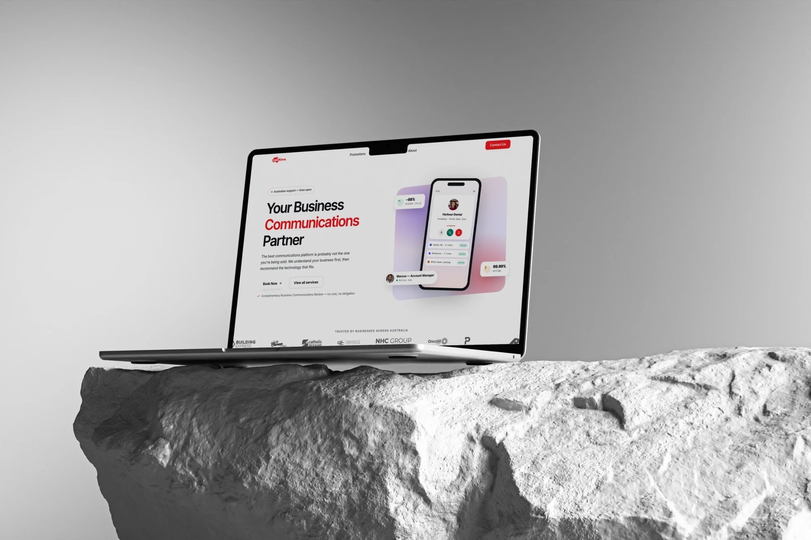
Rather than one design and a round of revisions, I designed three complete homepage variations — each a genuinely different interpretation of the agreed direction, not three versions of the same layout. We reviewed them together, picked one, refined it and signed it off before another page was designed. That kept the build fast and stopped the design drifting page by page.
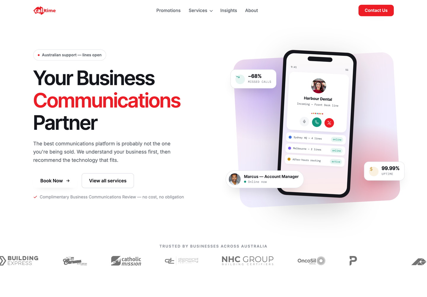
A warm off-white ground, oversized Inter Tight headlines and a single confident use of red. Restrained hairline-bordered cards, with one dark panel held back for each conversion moment.
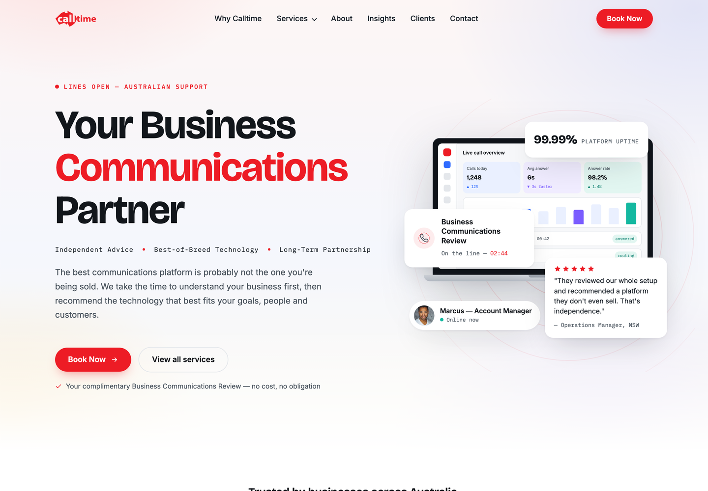
A magazine-led take: Bricolage Grotesque display, a handwritten accent, mono detail lines, and deep night panels breaking up the white.
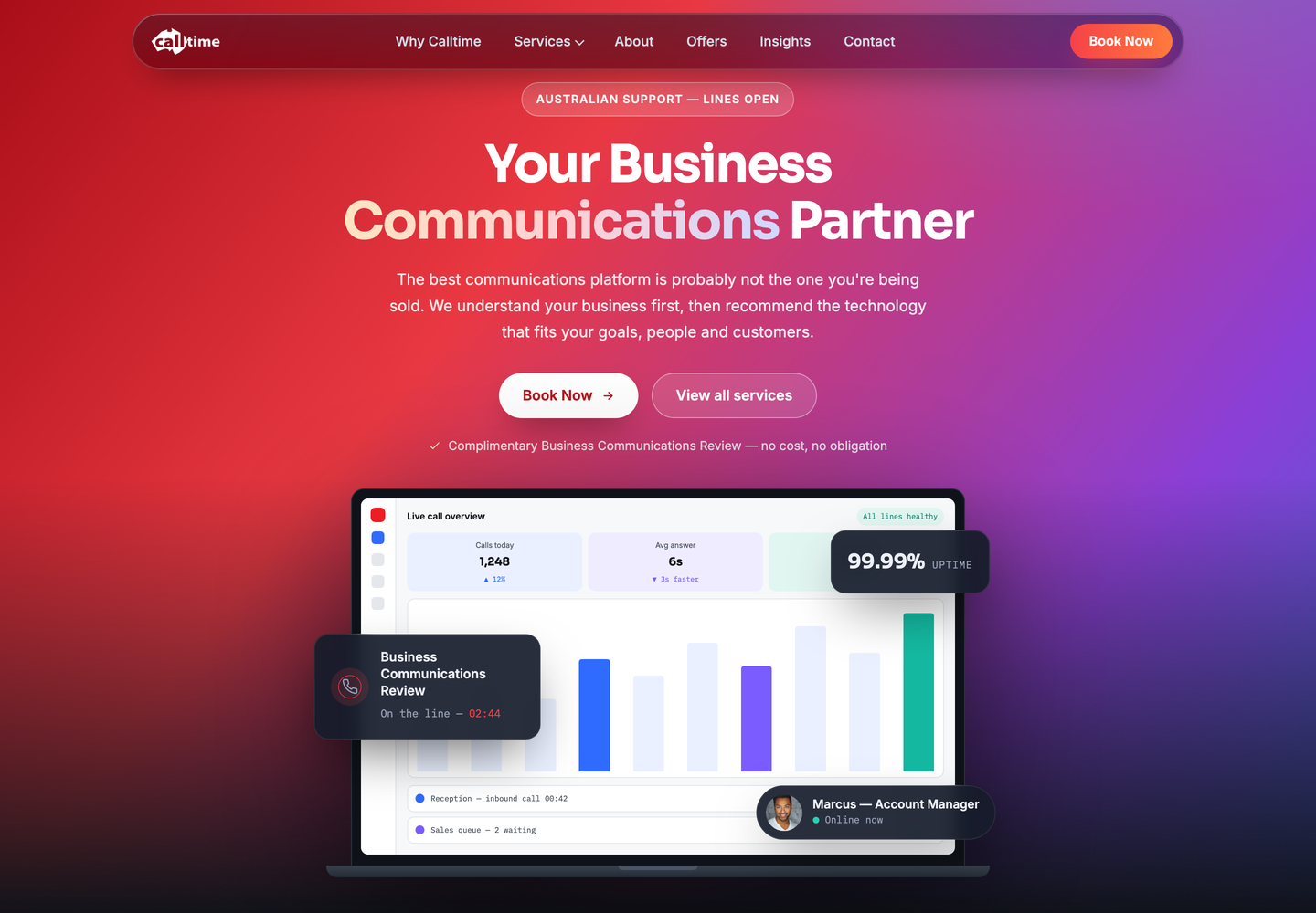
A dark, product-led interface built on Sora and a red-to-orange brand gradient, pushing the platform UI to the front.
Selected work
3 images